Heatmap
The Heatmap displays information in a two-dimensional grid of cells. Each cell represents a grouping of data.
| Features | Quantity | Notes |
|---|---|---|
| Required Dimensions | 2 | X Axis and Y Axis. |
| Required Measures | 1 | Measure cell color. |
Cell color indicates the relative value of the cells, from one end of the spectrum to the other.
Heatmaps are ideal for spotting outliers, which show up vividly on the color spectrum. They work best when the number of groupings is not too large, since large numbers of groupings cause the heatmap to exceed the viewport, making comparison harder (for such scenarios, consider using a Scatter Plot).
Heatmap Example
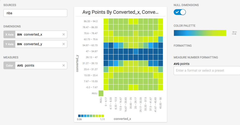
Create a new Heatmap. Choose a Data Source. This example uses NBA Play-by-play Stats from nbastuffer.com.
Set the X Axis dimension to converted_x with Binning On and Y Axis dimension set to converted_y with Binning On. The converted values represent the coordinate location on the basketball court, versus the original values, which represent the distance from the goal (as though all shots were half-court).

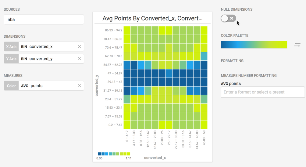
You can turn off NULL DIMENSIONS to get a chart that more closely resembles a basketball court.

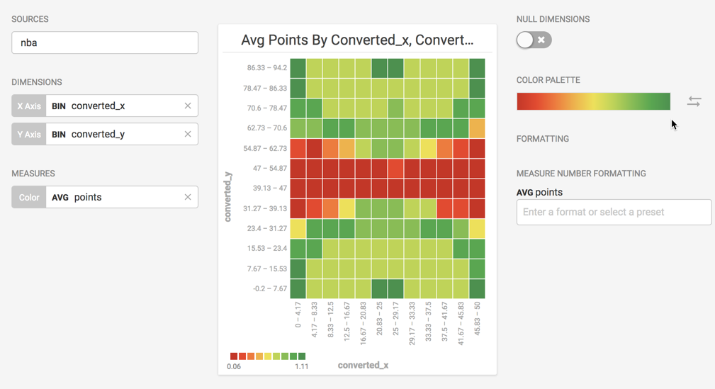
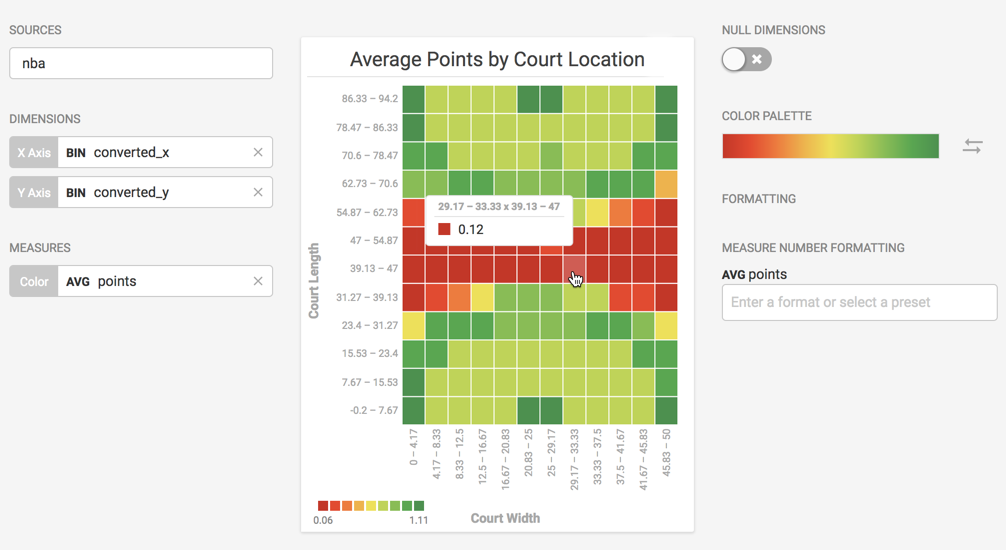
If you change the COLOR PALETTE to the red-to-green spectrum and reverse the direction, you can discern the highest average scoring locations (in green) from the lowest (in red) using commonly understood visual cues.

You can edit the chart title and axes labels to give them more meaningful names.

