New Combo Chart
Overview
The New Combo chart combines the functionality of a number of existing chart types and can display multiple data series in a variety of configurations. This flexibility makes it easier to create, change, and maniuplate charts in a variety of formats without having to create a number of different chart types on your Dashboard.
The New Combo chart is highly customizable; you can change type and orientation on the fly, switching between a number of different types and views to get the most effective chart for your data. New Combo chart configuration drop downs allow you to sort and filter by data type, making data discover easier and faster. For numerical base dimensions, you can configure measures to display as cumulative and percentage distributions. You can select dimension values dynamically or manually, and configure sorting logic you want to use.
You can pin chart legends can be pinned to the right, or you can superimpose them on the chart. You can also use the chart legend to toggle on or off the visibility of an individual group-by series.
Chart orientation can be toggled between vertical and horizontal. If you have bar and Combo charts that you have created previously, you can duplicate them as New Combo charts at the Dashboard level.
| Features | Quantity | Notes |
|---|---|---|
| Required Dimensions | 1-2 | Dimension 1 = X Axis, Dimension 2 = Series |
| Required Measures | 1-2 |
Example 1
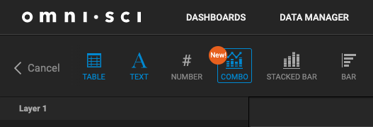
This example shows some of the flexibility of the New Combo chart. You want to create a chart that shows the number of flight arrivals for each selected carrier. Create a New Combo chart based on the flights data source, configure the chart type and granularity, and customize how the Group by dimension displays. Start by opening a new Dashboard, and then click the New Combo chart type.
Select the flights data source, and set the following dimensions:
- Base dimension: arr_timestamp
- Group by dimension: carrier_name
- Base measure: # Records
This results in the following chart.
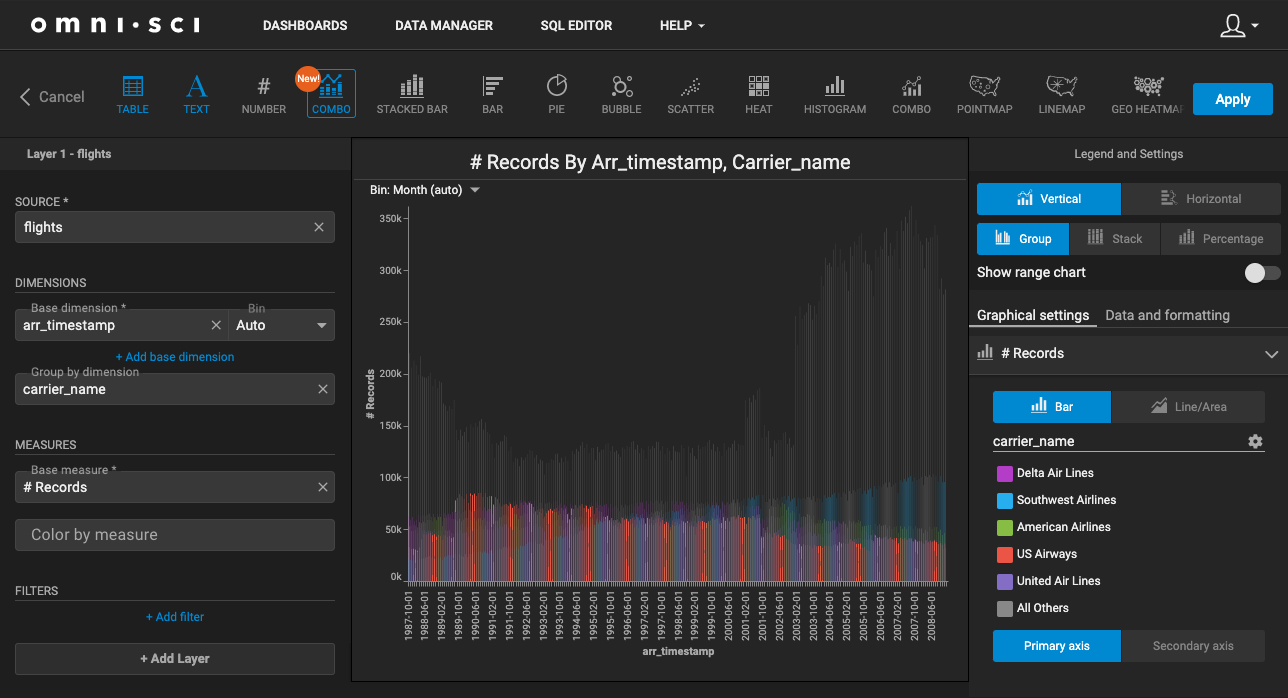
In Legends and Settings, you can configure the existing chart in a variety of ways:
- Change the type/orientation of the chart to Vertical, Horizontal, Group (Lines for Line/Area charts), Stack, and Percentage.
- Toggle Range charts on and off.
- Adjust data and formatting settings.
- Customize the Group by dimension.
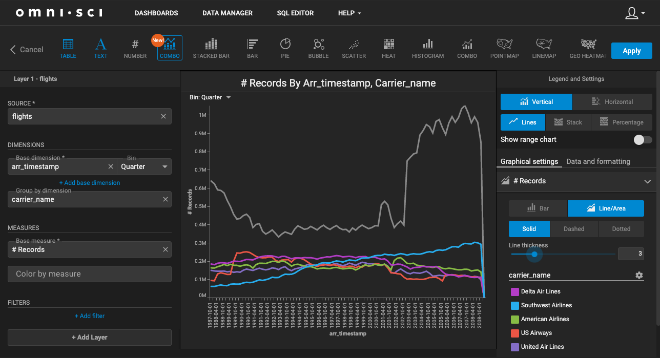
Let's change the chart to a Line/Area chart, and adjust the granularity:
- In Graphical settings, select Line/Area and change the line thickness to 3.
- In the Bin: dropdown, select Quarter.
Say you want to customize the number of carriers displayed. In addition to the dynamic values that already appear, you can manually select other airlines to appear in the chart.
- Open the carrier_name Group by dimension by clicking the settings icon to the right.
- Click + Manual Selection, and then select additional airlines. When you have finished, click Done.
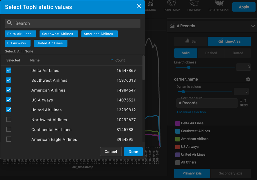
Now, 10 airlines are defined, and those selected manually appear with lock icon to the right.
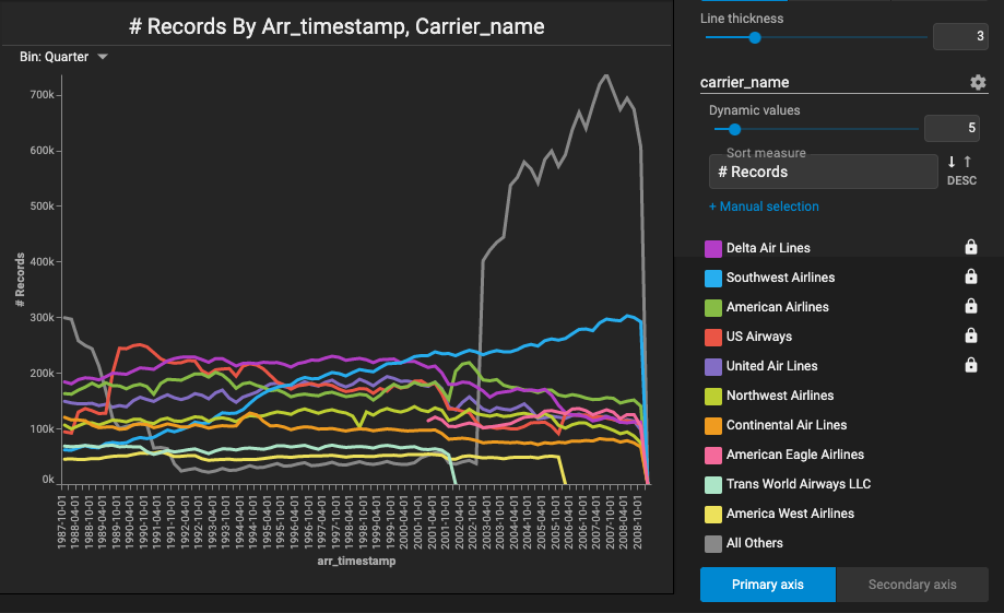
If you click the color next to the carrier name, you can change it. You can also hide a carrier from view by clicking the eye icon that appears when you hover over the carrier name.
Example 2
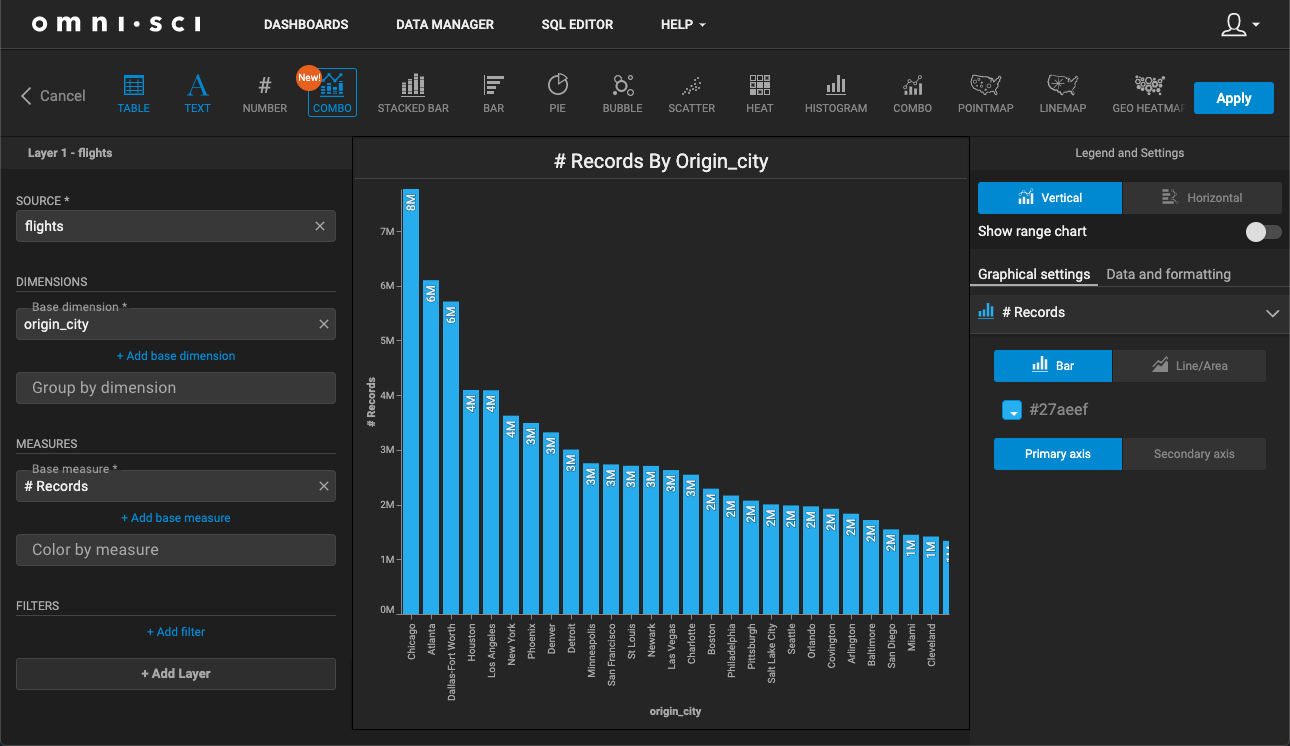
Let's create a chart that shows the number of flights based on origin city, and then see how many flights orginated from each city based on airline.
Create a chart using the flights data source, with the following:
- Base dimension: origin_city
- Base measure: # Records
The chart created looks like this. You can scroll horizontally to see values that are not displayed because of space constraints.
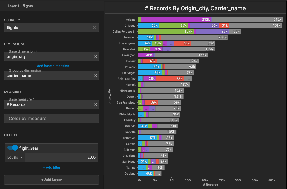
Let's add the carrier_name dimension, change the orientation to Horizontal, and select Stack to create a stacked bar chart.
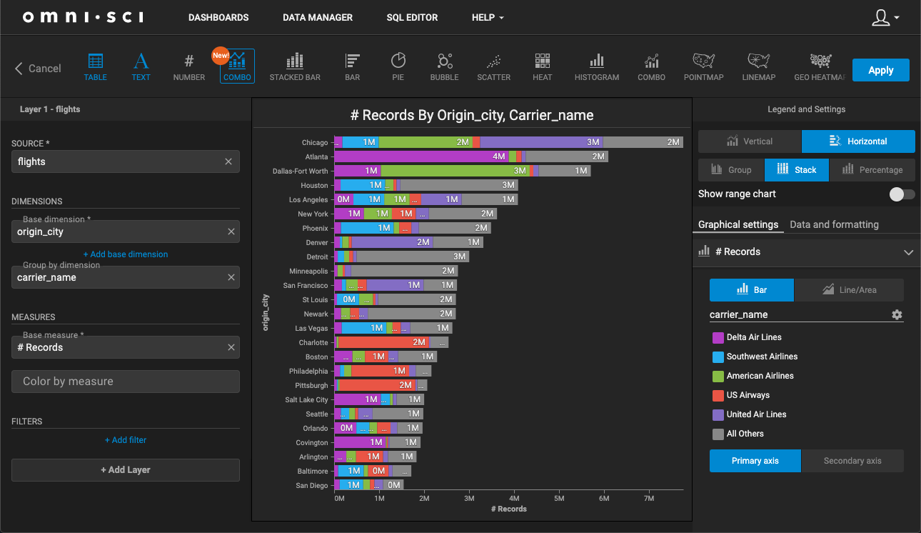
You apply filters in the same way as you would with other chart types. Here, you decide you want to see only those flights for year 2005. Click + Add filter, and select flight_year Equals 2005. You can toggle this filter on and off.
Migrating Other Chart Types to New Combo Charts
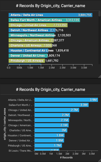
You can copy compatible chart types (Combo and Bar) as New Combo charts at the Dashboard level. To copy a chart as a New Combo chart in this case, a Bar chart), click the More Options icon at the far right, and then click Duplicate as New Combo.
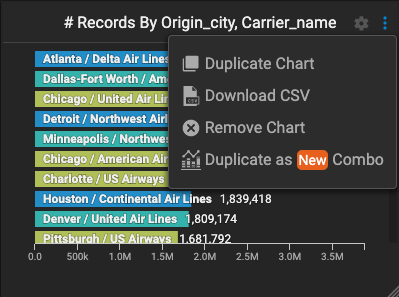
An identical chart of New Combo type is created and added to the Dashboard.
