Number Chart
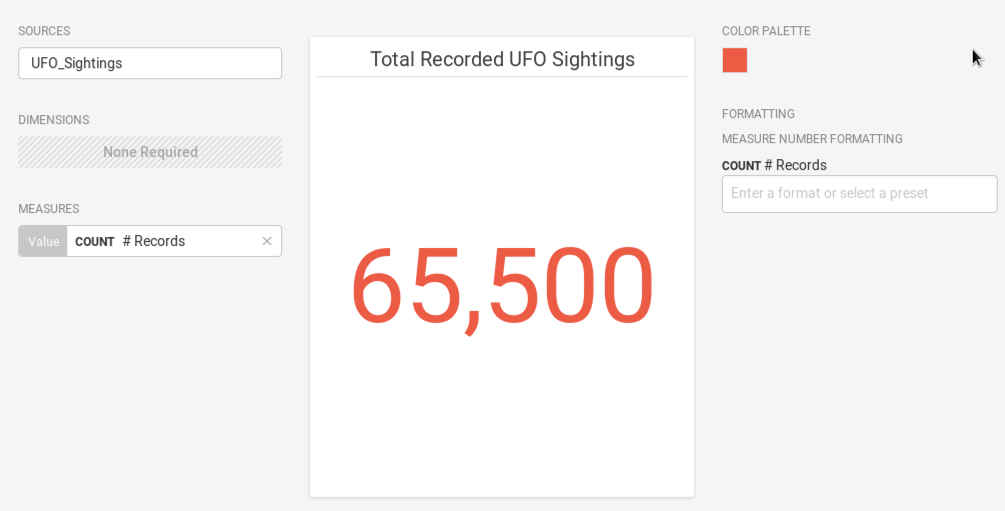
The Number chart displays a single aggregate measure with no dimensions.
| Features | Quantity | Notes |
|---|---|---|
| Required Measures | 1 | Maximum of one measure. |
Specify a measure and aggregation to create your Number chart.
Color Palette
Choose a color for your number that sets the correct tone. Red typically means danger or negative information, but it can also make the viewer more likely to agree with the value. Green is positive, but can be easier to overlook. Choosing the right color to match the information and message is both an art and a science.
Custom Measure Formatting
You can also use custom measure formats for the value in your chart. See Customizing Measure and Date Formats.
Number Chart Examples
Choose a Data Source. This example uses the official database of UFO sightings.
Choose an aggregate measure to display, and give the chart a title.

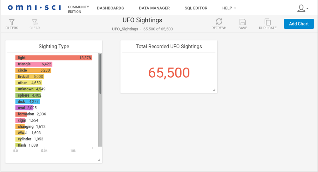
You can use a Number chart for dramatic impact, or to monitor a specific, important aggregate value from a dataset. You can use it to add emphasis to an important value in another chart on the dashboard.

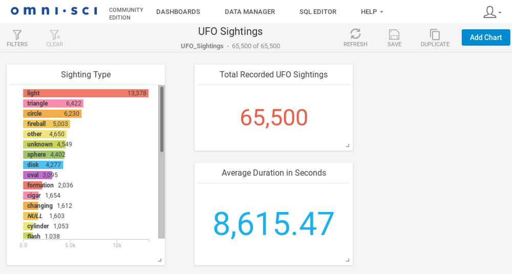
You can use multiple Number charts on the same dashboard to show several aggregate values at once.

